Share Cardiff is a project looking to bring together the community groups, social projects and community events across Cardiff. 
Through the development of an online directory Share Cardiff hopes to connect, support and empower the existing social projects and provide access and promotion for local groups, events and initiatives across the city.
[I worked with Share Cardiff to create the beginnings of their brand as they began reaching out and mapping the existing groups and projects from across Cardiff. Setting them up to discover their role as an active resource and advocate for supporting social good.]
We wanted the brand to be something that brought social action to the forefront and which celebrated and amplified the varied voices and communities of people across Cardiff.
With the directory itself to be populated by people's projects and images it felt right for the branding to step back almost entirely and give way to this content and the direct contributions and ideas of the people of Cardiff.
We created a concept for a rolling identity created from actual contributions from people to create an open, lived brand that celebrated individual identities​​​​ and was at home with the grassroots projects Share Cardiff was hoping to connect with and empower.
.

give more space????

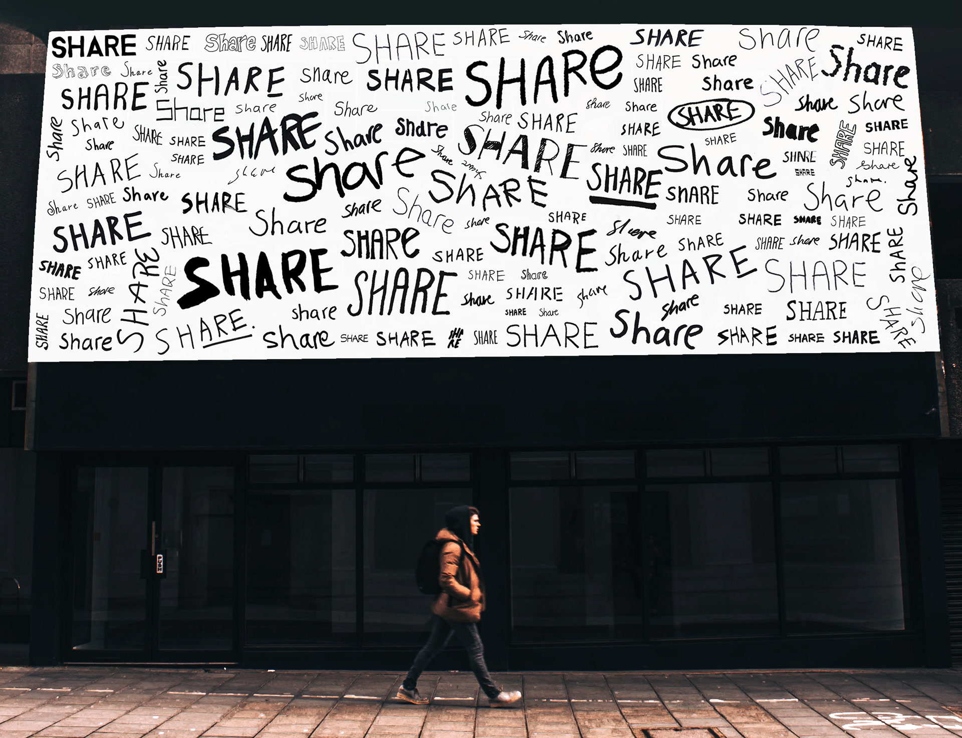
brand image - "here it is" 

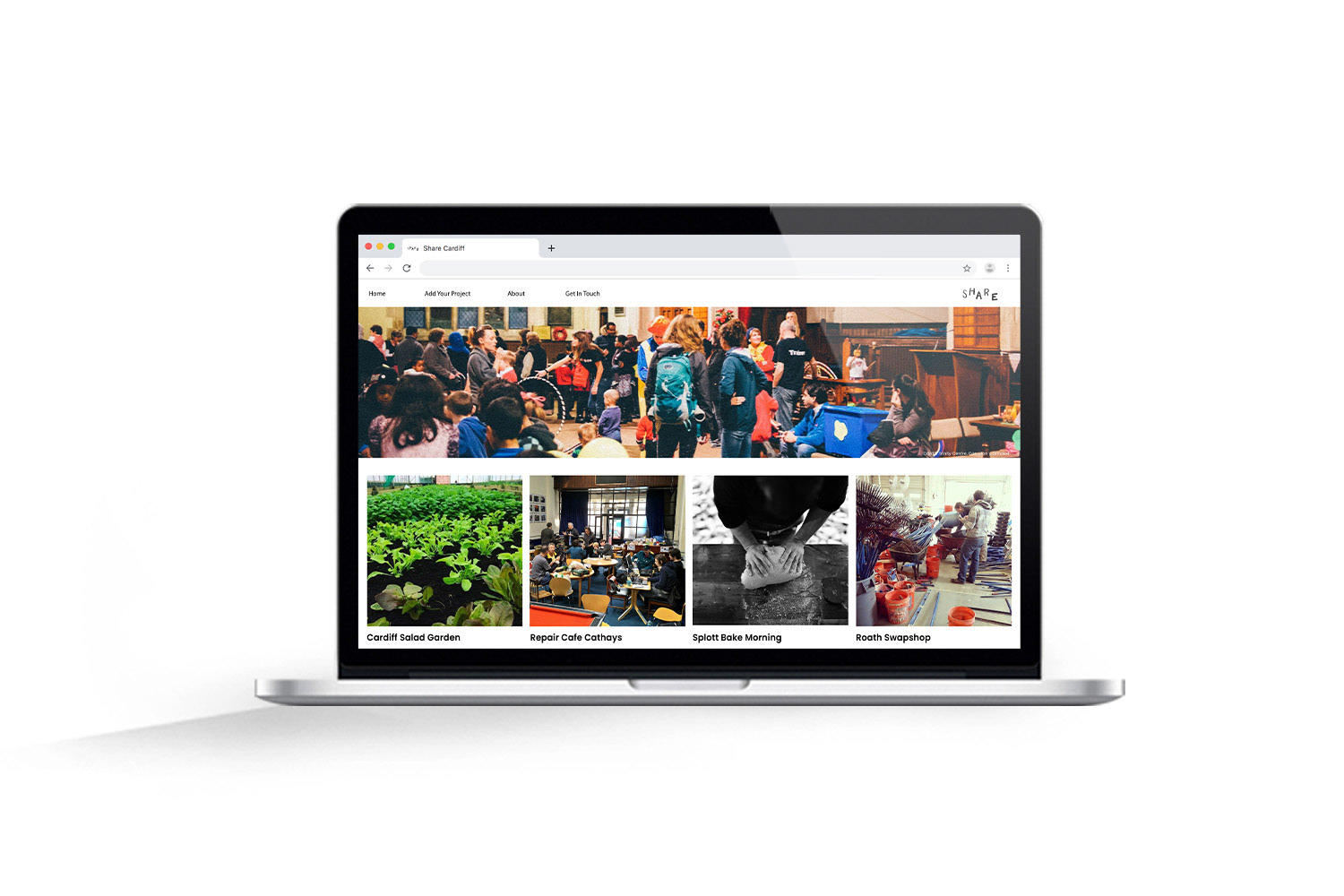
map? billboard? poster?...

just write these out? : 'name of organisation' in big cursive (white text on top of the images?)

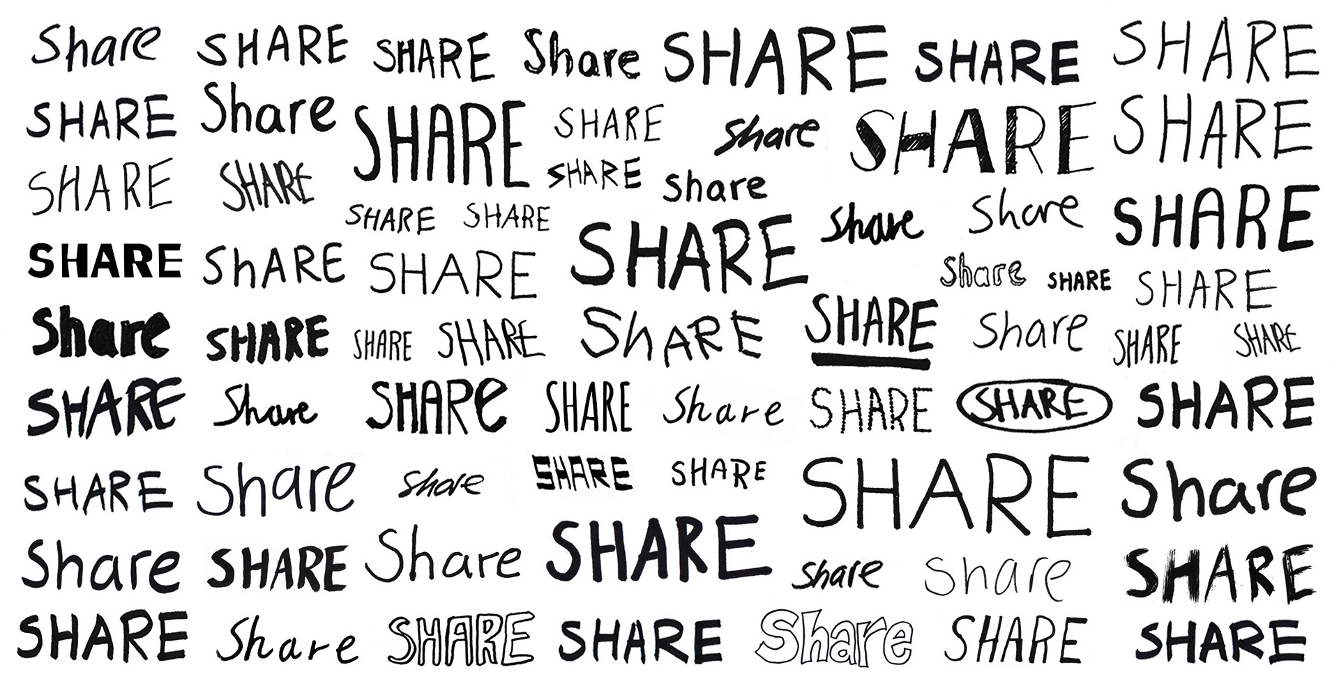
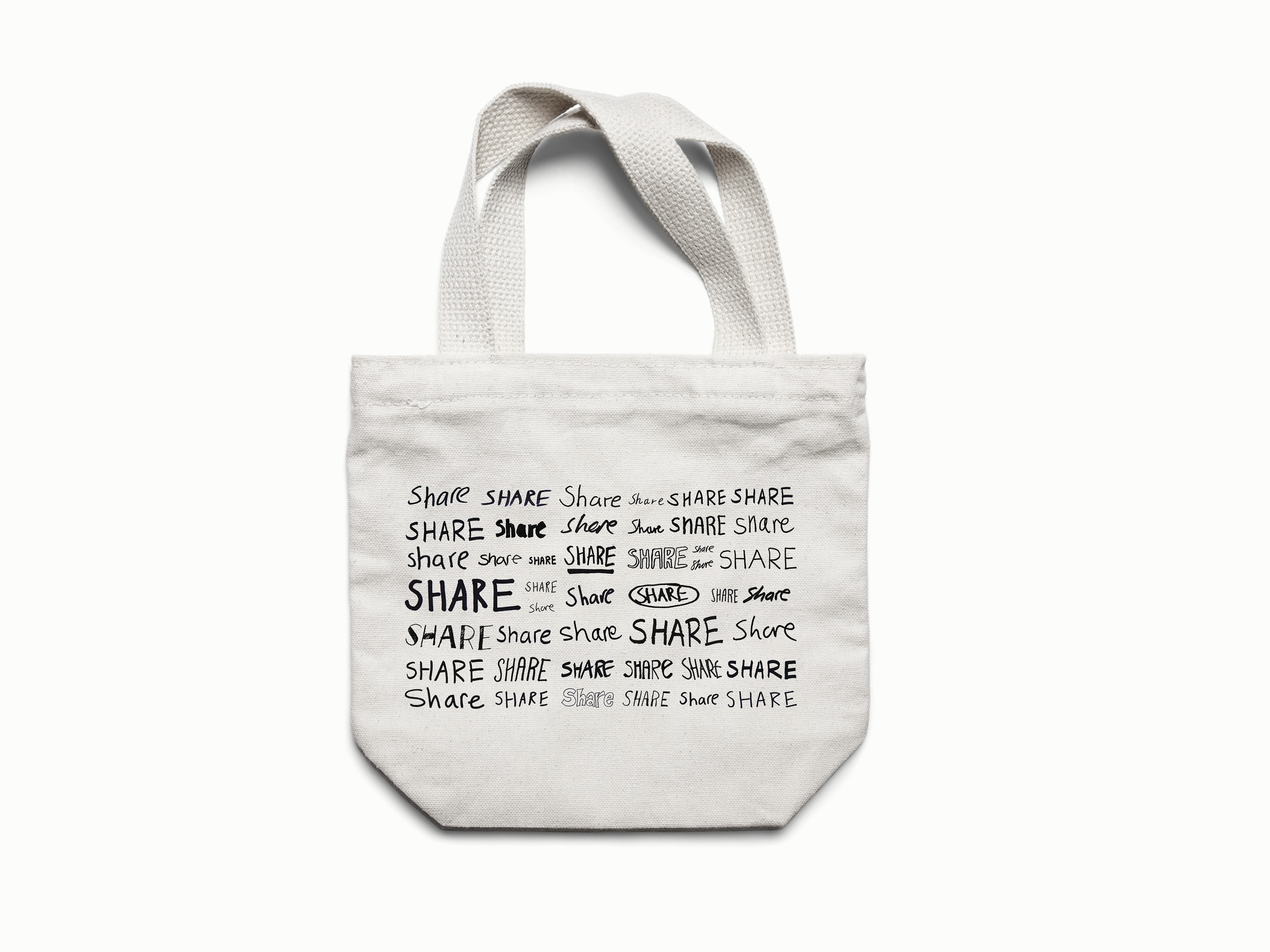
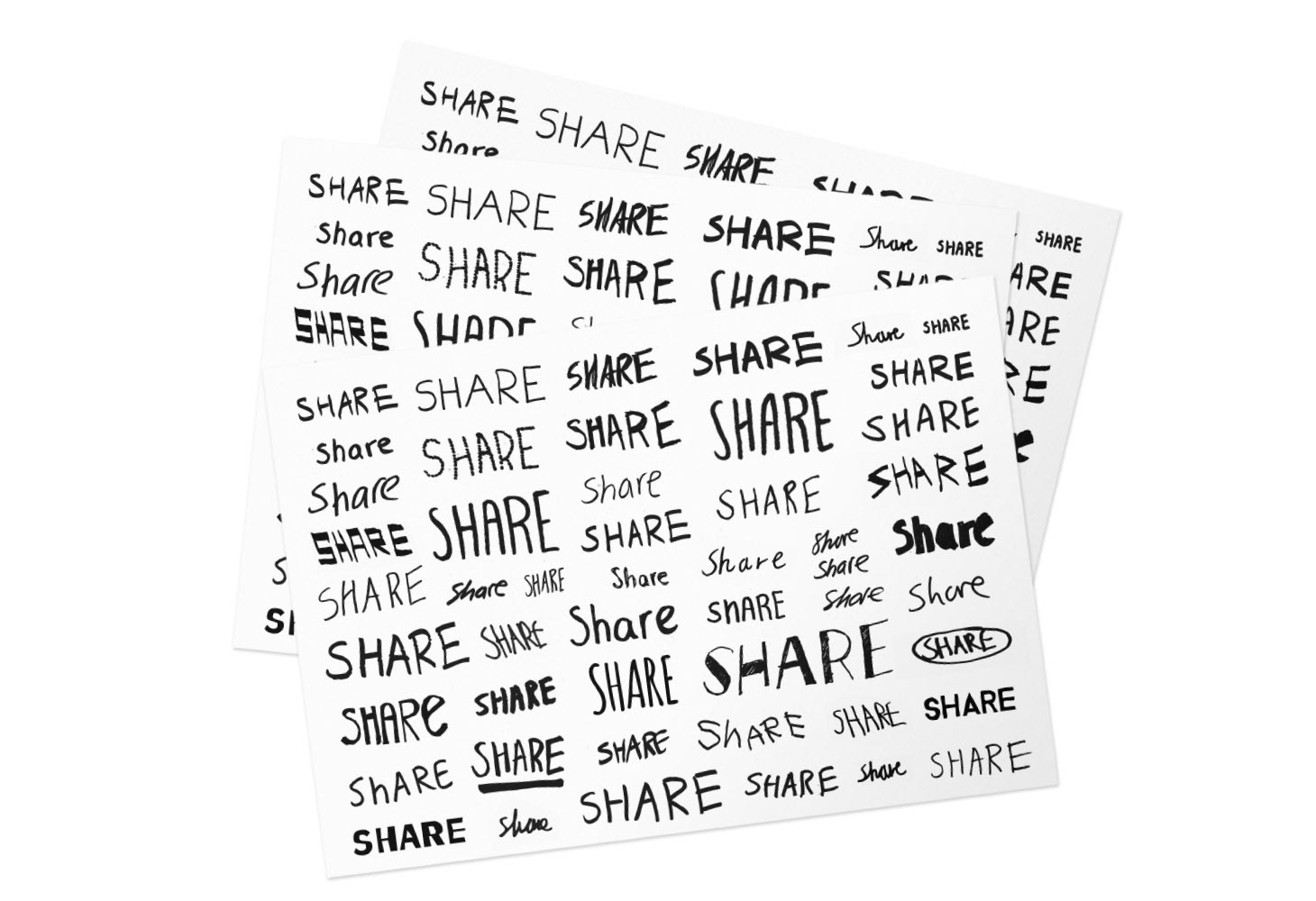
need multiple handwriting again......

could this go anywhere, or does it need to go before share 'reveal' ?


Generated at Share Cardiff's community mapping events where they were beginning to meet and map Cardiff's social projects the visuals? come directly form people contributions??? Social Media was also key to implementing the brand, and another space for generating contributions?/logos..... - ongoing??
We wanted the brand to be authentic and open and on the same level as its users/groups etc. and reflect this attitude? - attitude.

more graphic, bolder and more varied logos?

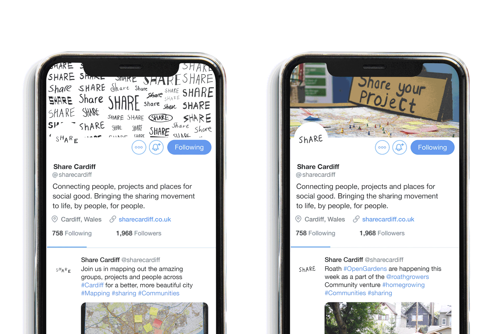
same for one or two right-hand profile pics? 

create something more graphic/colourful for Roath park - graffiti-style digital drawing off???!

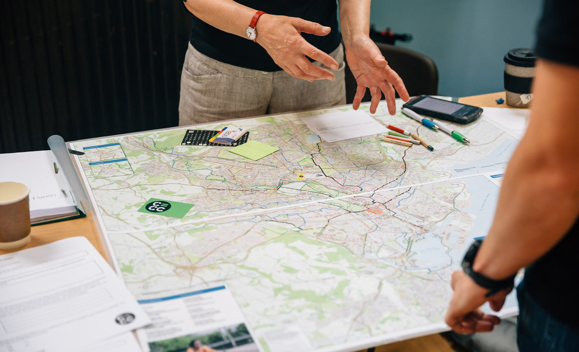
this is where the scope can be shown

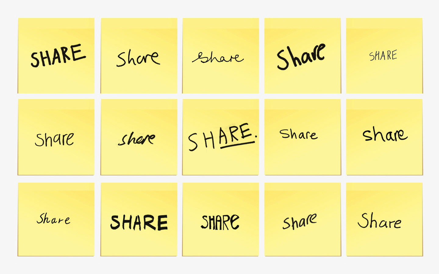
next level: more interesting share for left??? or bottom right?

Adjust crop on centre image? /use larger stock image?

resize top left (get non-watermark version)

push top share left in the image

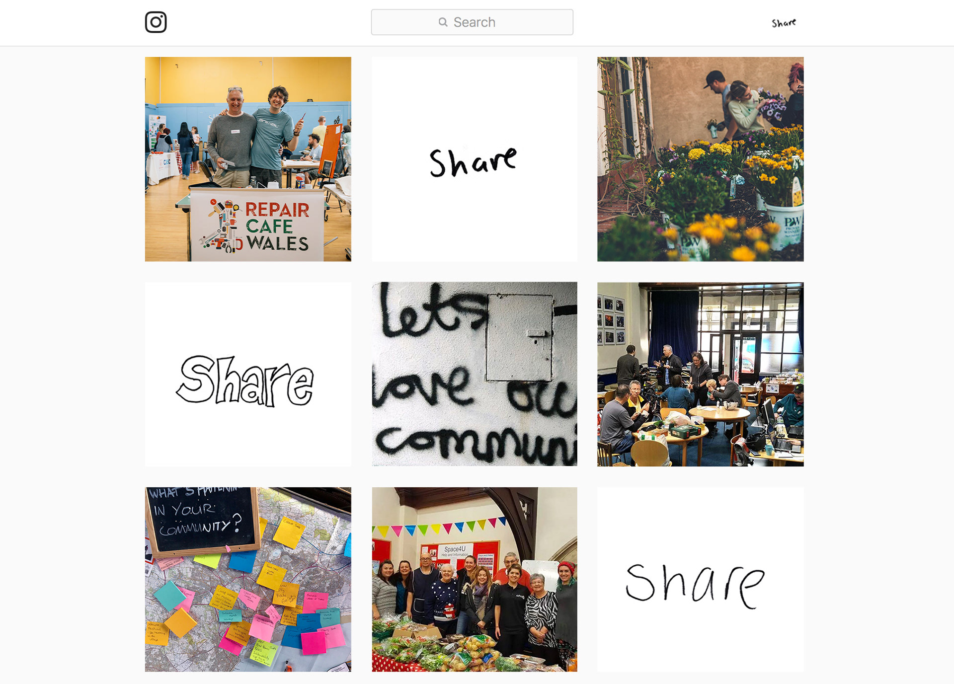
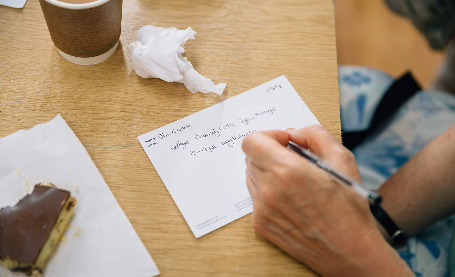
combine with postcards

It was important Share Cardiff not take away from the people and communities it wanted to work for, or feel like it was trying to consolidate or claim ownership over these. But instead that these groups were at the forefront, 
coming directly from them, and with this at the forefront of it's brand(ing)
this at the forefront of its work(/directory) and this thus also at the fore of its brand(ing). - merge attitude here ?

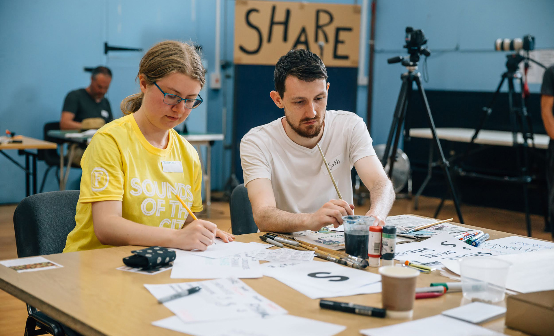
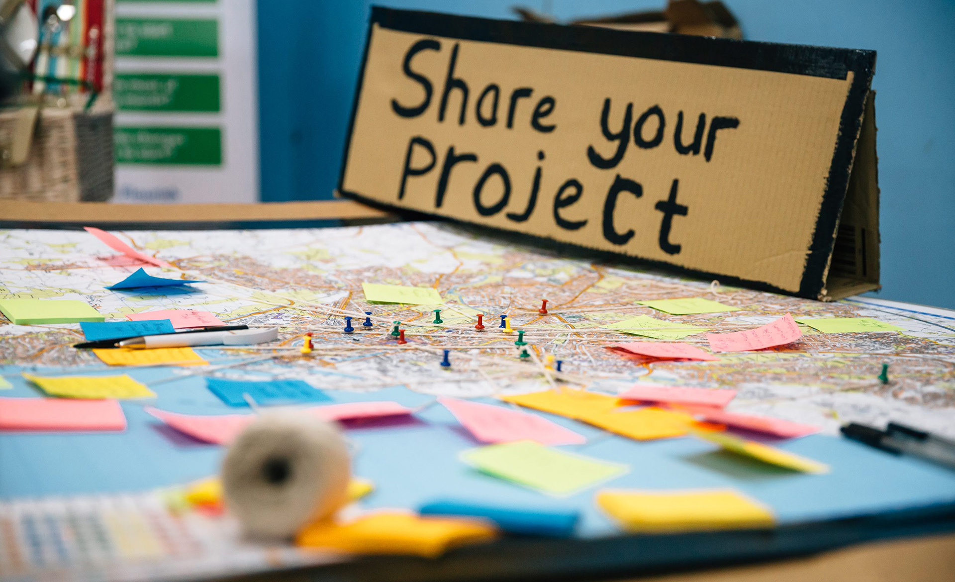
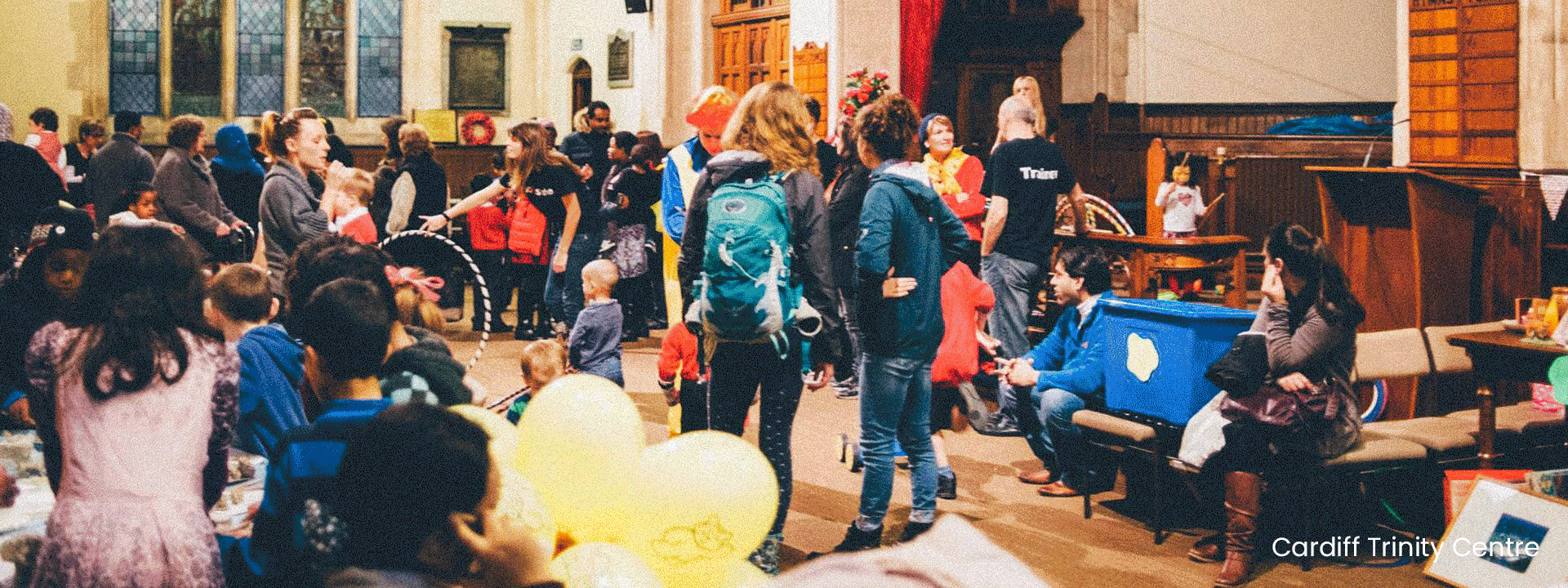
crop, may use this to show people actually creating the work - explains bit about how it (was) generated at events - may feel out of place/ruin the flow though... 

Cake/Postcard writing is also an option. Shows people submitting projects at share day and roundaboutly -the idea of visuals being created?...

make computer mock bigger? and edit text under each listing
consider cropping each image vertically, could fit more in, look more interesting/striking.
link to "trying to create an anti-brand" article? (not written)
Back to Top